
Before we talk about Mobile SEO factors and strategies to build an astonishing online presence, we need to know what is SEO for mobile? Why is it important for you to practice mobile SEO and how can you do that?
SEO for mobile – What is Mobile SEO?
Mobile SEO is the practice of optimizing a website for smartphone and tablet users so that they don’t get an inferior view of that desktop site. Mobile optimization makes your site accessible to search engine spiders when the visitor is a smartphone user.
Remember, mobile optimization does not mean to have a mini-version of your desktop website on mobiles.
We, Digie Crew, a digital marketing company provides the best and affordable SEO services in Los Angeles. You can connect with us to build an astonishing online presence and enjoy the services we provide.


Now, when you have drawn a rough idea about SEO for mobile, let’s have a look at the importance of mobile SEO.
The number of mobile searches is drastically increasing, along with mobile phone users, nearly 3.5 billion in the world. Nearly, 58% of all Google searches are done on smartphones, which means approximately 27.8 billion more queries are searched on mobile phones than desktops.
Hence, we can conclude that mobile is the future of search. Google is also overhauling its entire algorithms to prioritize mobile searches over the desktop.
What is Google’s Mobile-First Index?
Google’s Mobile-First Index ranks your site for mobile as well as desktop searches, based on the quality of the mobile version of your site.
Now, you might have understood the need to work on the following mobile SEO factors, so that your site does not inadvertently turn mobile visitors away.
We’ve got 3 options to configure a site for mobile phones:
-
“M.” Configuration (separate URLs)
In this configuration, mobiles and desktops have different URLs.
And your site will figure out the device that the visitor is using and directs them to the URL optimized for their device.
Google doesn’t recommend separate URLs as a site set up for mobile SEO because it’s difficult to implement and maintain.
-
Dynamic Serving
In dynamic serving, all the content is on the same URL, but a different HTML/CSS code is shown to the users, depending upon the devices they use.
You have to create multiple versions of your content for every new device that finds its way into the market. And if you failed to do so, your site will not be able to recognize the device and will show a terrible version of your site to the users.
-
Responsive Design
Responsive Web design suggests that the website design should respond to the user’s behavior and environment based on screen size, platform, and orientation.
The page layout and content responds to every user, using any device, without using separate URLs or HTML codes.
Now, let us go through some of the mobile SEO factors, you must know for having an astonishing online presence:
-
Don’t Block JavaScript, CSS and File Images
Blocking resources from mobile users to make the page load faster, is a very bad strategy for practicing mobile SEO.
Google considers the mobile version of your page as the “main” version, while indexing. And if your content is hidden for mobile users, they may not index or crawl your content.
You can use the “Fetch as Google” feature of Google Search Console, to actually see how your published web page appears to Google. This will let you know if you’re blocking any device from crawling certain parts of your site.
-
Instead of Flash, Use HTML5
If your animated content is coded in flash, it will not work for mobile devices. It’s suggested that you use HTML5 for video embedding to improve your website’s usability on all devices.
-
Make your content readable for mobile users
Some pages are technically optimized but appear hard to read for mobile users. So, none of your mobile SEO strategies are going to work, if your content is not in a readable form.
Therefore, to make your content easy to read for all users,
- Use at least 14px font
- Use 1-2 lines per paragraph
- Line length should be between 50-60 characters
- Make sure there’s a huge contrast between text and background
-
Don’t forget the “Viewpoint Content” tag
If you are using responsive design, then the tag helps in changing the size of your page based on the user’s device. As per Google’s recommendations, your viewpoint meta tag should appear as,
<meta name=viewport content=”width=device-width, initial-scale=1”>
If you forget this tag, or if it’s not configured correctly, your site could look funky to mobile users.
-
Eliminate large pop-ups
Using large popups on your site can seriously affect your rank on SERPs. Google’s priority is to show amazing content to its users.
So, Google rolled out an update that specifically targets “Intrusive pop-ups” providing a few examples of acceptable popups and popups that can get your site penalized.
-
Boost your mobile page speed
Google has identified three seconds’ time for a site to load. Over three seconds all kinds of bad things start to happen like customers fleeing to competing websites, lower conversions, and a deteriorating brand name. so, in under three seconds, you’re as good as gold and your customers too!
-
Implement these 4 quick mobile UX hacks
These are four quick mobile UX hacks designed specifically to boost your site’s usability for mobile Google searches.
- Make small header images
- Optimize title and meta descriptions
- Use lots of “Negative” space
- On a desktop, you can use a cluttered page but on a phone, it is impossible to do so. If a mobile user has trouble reading your content or finding what they need, they’ll bounce back to the search results.
- Put social share buttons as a tab bar at the bottom of the page
-
Fix your mobile CTR to get more traffic
Organic Click Through Rate is a major mobile SEO factor in Google ranking.
So, for getting information about CTR, for your website, you can head over to the Google Search Console’s performance report.
If your desktop CTR crushes your mobile CTR for any issue, eliminate it quickly.
-
Work to Improve Your Bounce Rate
Compare your desktop vs. mobile bounce rate and dwell time in Google Analytics. This will help you know how your UX signals compare on desktop vs. mobile.
-
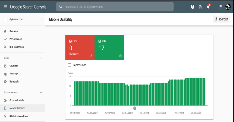
Eliminate Mobile Usability Issues
Google’s Mobile Usability Test, lets you know if your site has any mobile usability issues.
To use it, head over to your GSC account. Then click on “Mobile Usability” and google will let you know if mobile users have trouble using your website.
-
Fix Faulty Redirects and Cross Links
Faulty redirects and cross-links seriously affect your ranking on SERPs. So, check for your crawl errors in Google Webmaster Tool and eliminate them. Plan a regular website health check to make sure that your mobile-friendly design is always operating aptly.
Therefore, when you give your website a makeover with these mobile SEO strategies, you can look forward to:
- More website traffic
- Improved user experiences
- Higher conversion rates
- Increment in time spent on your website
- Lower bounce rates
- Minimum page loading time
- More visitor engagement
- Improved search engine performance
Conclusion:
So, now this blog might have convinced you, for practicing mobile SEO techniques and making it mobile-friendly. Technology is evolving every day and every minute the world is coming up with new ideas to transform our vision about technology. Hence, in this race of providing the best to our users, we cannot dream to rank high on SERPs, using the old school techniques.